How to Build High- Converting B2B Landing Pages for Lead Generation
Most B2B landing pages fail not because of bad design — but because of misaligned strategy, too many distractions, and untested assumptions. This guide walks you through the proven framework for building landing pages that consistently convert qualified leads into pipeline.
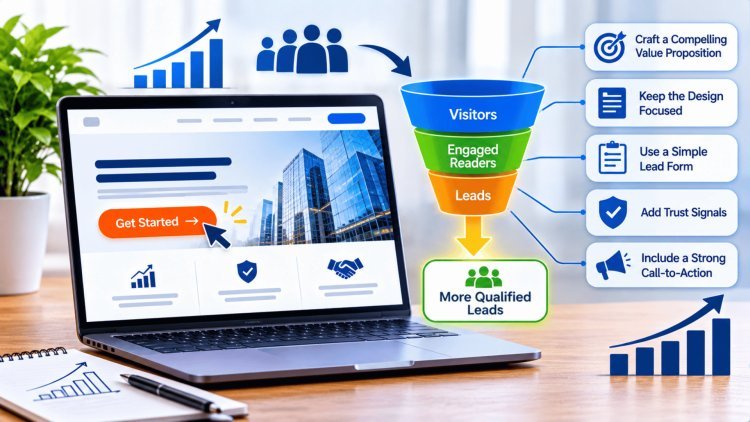
The First Screen Must Earn the Next Click
Your above-the-fold experience is the single most important piece of real estate on your landing page. Visitors make a judgment about whether to stay within 3–5 seconds of arrival. Everything visible before the scroll must work in concert to answer one question: "Is this for me, and is it worth my time?"
Clarity Beats Cleverness
Studies consistently show that straightforward, outcome-driven headlines outperform creative or abstract ones — in B2B contexts, clarity wins 88% of the time. Your headline must name the problem your audience is experiencing, the outcome your offer delivers, and ideally, who it's for — all in one sentence.
Avoid clever wordplay, vague mission statements, or company-centric language. "We help businesses grow" tells the visitor nothing. "Generate 3x more qualified leads from paid traffic — without increasing ad spend" tells them everything.
"We help businesses grow"
"Generate 3x more qualified leads from paid traffic — without increasing ad spend"
One Offer. One Audience. One CTA.
The most common conversion killer in B2B landing pages is the temptation to serve multiple goals on a single page. Every additional option you give a visitor reduces the probability they'll take the action you actually want. The page exists for one purpose only: drive one specific action from one specific audience persona.
One offer
A demo request, a whitepaper download, or a free audit — not all three
One audience
VP of Marketing, not "marketing and sales teams and executives"
One CTA
Every button, link, and visual element should point to the same action
One message
Your subheadline, body copy, and imagery must all reinforce the same promise
The best-performing B2B landing pages strip away everything that doesn't serve the conversion goal. When in doubt, remove — don't add.
Even a beautifully designed landing page will fail if visitors arrive and feel like they’ve landed in the wrong place—or if they’re offered an easy escape route before they convert. Intent alignment and distraction elimination are the structural foundations of a high-converting page.
Message match builds confidence at arrival; navigation and conversion-leak removal keeps attention focused on the single action that matters.
Match Intent,
Remove LeaksMatch the ad promise. Remove every competing exit.
B2B buyers are skeptical by nature. They’re making decisions that affect their careers and their organizations. Your landing page must systematically dismantle doubt and reduce every point of friction between interest and conversion. The right page structure — combined with optimized form design — can dramatically improve completion rates.
Lead with the clearest possible articulation of the value delivered. Address your visitor’s core pain point and show the transformation your offer enables. Keep it outcome-focused, not feature-focused.
Immediately below the fold, stack your credibility signals. Customer logos, specific testimonials with names and titles, case study results, and G2 or Capterra ratings all work to lower psychological resistance before visitors reach the form.
Place objection-busting copy and trust signals directly beside or above your form. Answer the unspoken questions: “Will I be spammed?”, “Is this worth my time?”, “Can I trust this company?” — before they’re asked.
Research from Apexure’s 2026 client data shows that reducing form fields from 7+ down to 3–5 can lift form completion rates by anywhere from 25% to 120%, depending on the offer and audience.
Name, work email, and company. Use your CRM and enrichment tools (Clearbit, Apollo, ZoomInfo) to fill in the rest automatically post-submission.
Place customer logos, a one-line privacy statement (“No spam. Unsubscribe anytime.”), and a star rating or testimonial within visual proximity of your submit button.
Replace generic “Submit” with specific, outcome-driven copy: “Get My Free Audit,” “Book My Demo,” or “Download the Guide” — specificity increases click-through.
Testimonials that include the contact’s full name, job title, company, and a photo convert significantly better than anonymous quotes. Specificity builds credibility. Combine a clear three-act page structure with a short, well-supported form and you systematically convert reluctance into action.
Proof + Forms Convert Reluctance into Action
First Screen: Benefits
Proof Zone: Social Proof
Close: Objection Handling
Form Optimization: Less is Dramatically More
Ask Only the Essentials
Trust Signals Near the Form
CTA Button Copy
Key Conversion Principle
Building a landing page is only the beginning. Sustainable B2B growth comes from combining strong technical infrastructure, intelligent lead-routing logic, and a disciplined testing framework. High-performing organizations consistently optimize every stage of the lead journey—from acquisition through qualification and sales engagement—to ensure marketing efforts generate measurable business outcomes.
Every lead submission should flow directly into the CRM with complete attribution data. Capturing campaign, channel, keyword, audience, and creative parameters enables accurate reporting, optimization, and budget allocation decisions.
The thank-you page should continue the customer journey by setting response expectations, introducing relevant content, promoting secondary conversion actions, and supporting remarketing initiatives.
Automated routing rules should distribute qualified opportunities based on territory, company size, industry, account ownership, and business segment to ensure rapid follow-up and consistent lead handling.
The headline is typically the highest-impact conversion variable. Compare outcome-driven messaging against pain-point-focused positioning to determine which value proposition resonates most effectively.
Evaluate shorter versus longer forms to balance conversion volume and lead quality. Mobile visitors often respond more favorably to simplified submission experiences.
Experiment with CTA wording and social-proof positioning to identify combinations that strengthen trust and improve conversion behavior.
Compress images, minimize third-party scripts, optimize code delivery, and continuously monitor page performance. Fast-loading pages improve both conversion efficiency and paid media ROI.
Sustainable B2B lead generation is built on three foundations: reliable infrastructure, intelligent lead routing, and continuous experimentation. Organizations that connect attribution data, automate lead distribution, optimize high-impact conversion elements, and maintain strong technical performance create landing page systems that consistently generate qualified opportunities at scale. Winning pages are not designed once—they are continuously measured, tested, refined, and improved.
Execution, Routing & Continuous Testing
Build the Infrastructure Right
CRM Integration & UTM Tracking
Thank-You Page Flows
Lead Routing Logic
Lead Management Workflow
Test in Priority Order
Headline Testing
Form Field Count
CTA & Social Proof
Mobile Performance Requirements
Final Strategic Takeaway
What's Your Reaction?